When creating your articles, you may be required to insert additional media or text sections. You can achieve this by using the Article Editor options located at the bottom of your Article.
Editing Your Content
You can edit the Settings of your Content Element’s at any stage by selecting the Cog Icon located in the top right-hand corner of your Content Element and adjust your settings as needed.
You can also use the Bin Icon to remove the Content Element from your newsletter.
Reordering your Content
You can use the Arrow Icons to move your Content Elements either up, or down within your Article.
Please note: If you need to move a Content Element from one Article to another, you will need to recreate the Content Element in the new Article. The Arrow Icons will not allow you to move Content Elements between Articles.
Text
Allows you to add additional Text Items or Sub-Articles to your existing Article.
To add a Sub-Heading, highlight your desired text and select the H3 (Heading 3) or H4 (Heading 4) option based on the type of heading you wish to create.
Text Formatting
To apply formatting to your Text Content, simply highlight the text you wish to format. The below Toolbar will appear and you will be able to select your desired formatting.
Numbered/Bullet List
These options will allow you to create a Numbered or Bullet List item for your newsletter.
Pull Quote
This option will allow you to apply the Pull Quote style to your text.
This is best suited to draw attention to a particular piece of text within your Article. An example has been added below:
Table
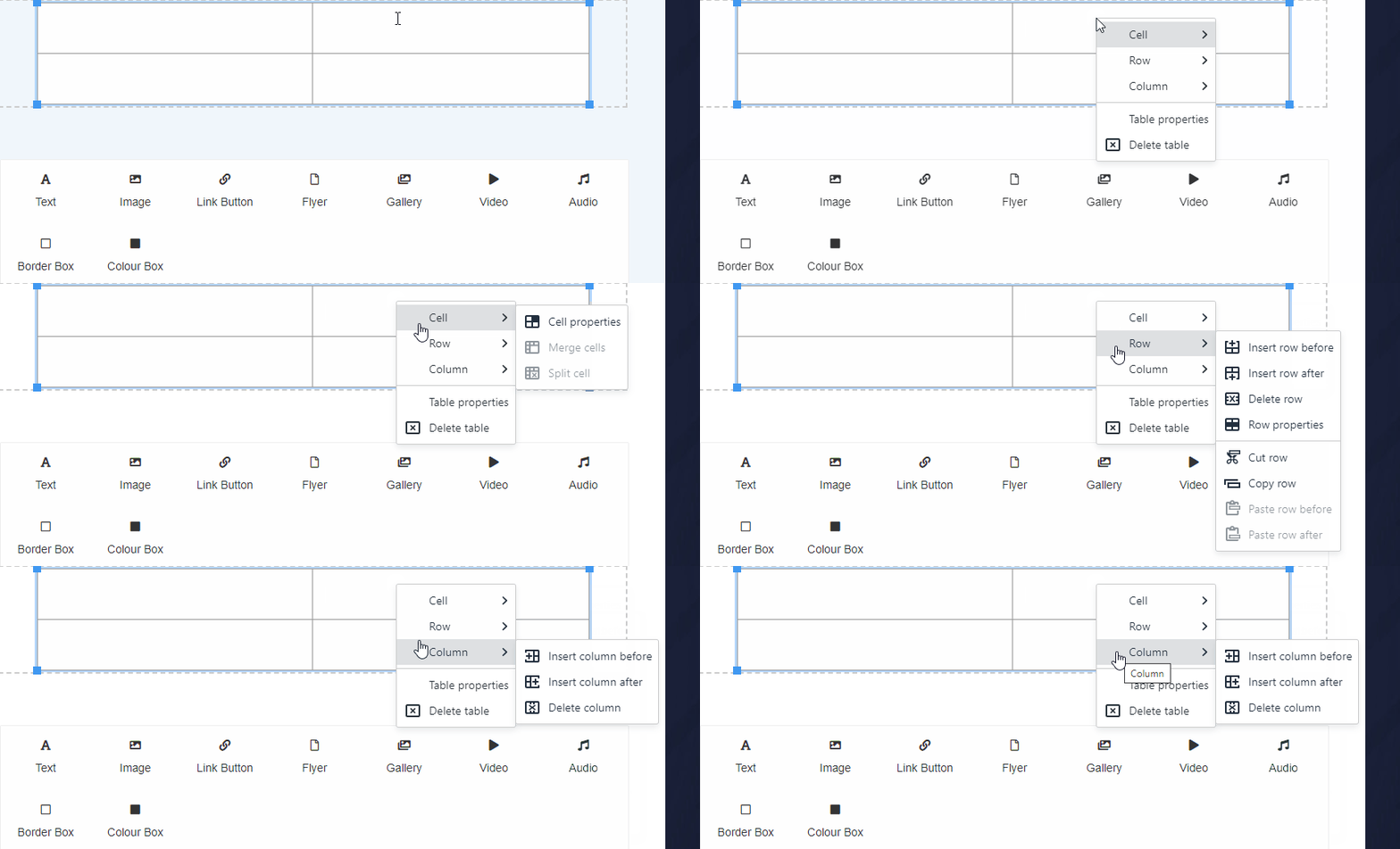
Using this icon will allow you to create a Table for your Content Builder Newsletter.
- Select the Table Icon
- Use the Table Toolbar to edit the details of your Content. The options available to you are listed below from Left to Right on the Toolbar
Table Properties – Will allow you to edit the options on your Table
Delete Table – Will remove the entire table from the Newsletter
Insert Row Before – Inserts a Table Row before the currently selected Cell
Insert Row After – Inserts a Table Row after the currently selected Cell
Delete Row – Will remove the currently selected Row
Insert Column Before – Inserts a Column before the currently selected Cell
Insert Column After – Inserts a Column before the currently selected Cell
Delete Column – Will remove the currently selected Column
You can also open the Table Formatting Tools by right clicking on your table for further customisation options.
Wildcard
A Wildcard is a string of code that will automatically pull information from your system and display it within your newsletter.This option will enable you to add predetermined Wildcards into your newsletter. Simply select the field and pick they Wildcard you would like to insert.
Please note: The Wildcards will only display when you preview the content. During the editing process, you will only be able to see the Wildcard Code, and not the information it is set to retrieve from your account.
Text Settings
When using the Edit Cog for your Text Content Element, it will give you access to the following options:
- Layout: This option lets you toggle between the available layout options for your Content Element
Text with Left/Right Image Settings
When using the Edit Cog for your Text with Left/Right Image Content Element, it will give you access to the following options:
- Image: This option allows you to upload or select a previously uploaded image to include within your Content Element
- Image Style: This option allows you to add or remove a border around your added image
- Layout: This option lets you toggle between the available layout options for your Content Element
Image
Allows you to add Images to your Article.
To add an Image:
- Click the default Image holder.
- Select the Upload button (or select one from your Media Library using the Browse button).
- Select Choose file and select the image from your system.
- Select Upload.
- Select your Image Style.
If you need a border on your image select Border otherwise select No Border.
You can adjust the image alignment using the Image Alignment drop down item.
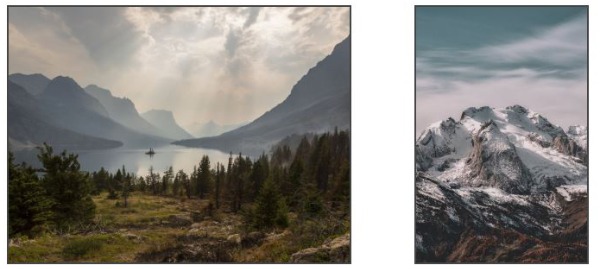
You can also adjust the layout to include one, two or three images using the Layout drop down item. Note: The Two (Mixed) item is used for images that have different widths. You will also have a field to adjust the image’s Height, this number will be listed in pixels. See the example below:
Image Settings
When using the Edit Cog for your Image Content Element, it will give you access to the following options:
- Image: This option allows you to upload or select a previously uploaded image to include within your Content Element
- Image Style: This option allows you to add or remove a border around your added image
- Image Alignment: This option allows you to apply an alignment setting for your image
- Layout: This option lets you toggle the number of images that are to be included in this Content Element
Link Button
Allows you to add a Button linked to an external source.
To add your link button:
- Click the button that is created
- If the button is for a document or other file:
Click the Upload Icon to upload a new file
Click the Search Button to search for a previously uploaded file - If the button is for an external website:
Change the URL field to the desired web address
Change the Name to best reflect the source of your button
Example name: Click here to view the Schoolzine Website
or
Click here to download the SZapp Flyer - Turning on the Hide URL slider will hide the URL field content from the newsletter
- Adjust the Icon drop down to best reflect the source of your button
Link Button Settings
When using the Edit Cog for your Link Button Content Element, it will give you access to the following options:
- Document: This option allows you to upload or select a previously uploaded document to link to your button
- URL: This option allows you to add a URL link that your button will direct to a particular website
- Name: This option allows you to change the text that displays on your button
- Hide URL: This slider will toggle the visibility of the URL when your newsletter is viewed
- Icon: This option allows you to change the icon that displays on the left hand side of the button
Flyer
Allows you to add a PDF Flyer to your newsletter. This option will allow you to both embed the flyer as an image, and include an option to download the full document.
To add your flyer:
- Click the Button that is created
- Click the Upload Button to upload a new file
or
Click the Browse Button to search for a previously uploaded file
The URL field will automatically populate when a file is selected - Change the Text to best reflect the source of your button
Example Text: Click here to download the SZapp Flyer - To show your document as a image make sure the Show Flyer slider is set to Yes
- To show the download link make sure the Show Download Link slider is set to Yes
Note: When using the Show Flyer option, large PDF files might lead to longer than normal load times. If your PDF does not show, please allow extra time for this file to display.
Flyer Settings
When using the Edit Cog for your Flyer Content Element, it will give you access to the following options:
- PDF Flyer: This option allows you to upload or select a previously uploaded document to link to your button
- URL: This option allows you to add a URL link that your button will direct to online PDF document
- Text: This option allows you to change the text that displays on your button
- Show Flyer: This slider option will toggle on an automatically generated visual of your linked document
- Show Download Link: This slider option will toggle the download link for your linked document
Gallery
Allows you to add multiple images in a small area. We recommend using this feature anytime you have more than 3 images in a single section. Please note: There are only two file types that you’ll be able to use: JPGs and PNGs.
To add your Gallery:
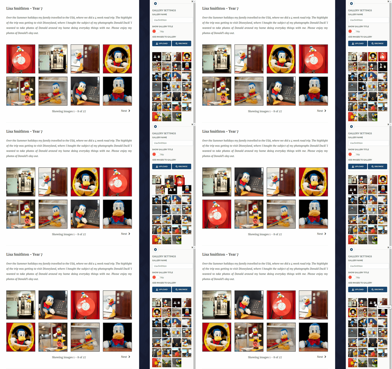
- Select any of the image boxes created
- Change the Gallery Name to apply a caption to your Gallery
- To show your Gallery Name make sure the Show Gallery Title is set to Yes
- Click the Upload button to upload new files
or
Click the Browse Button to search for previously uploaded files
Note: You can filter by previously used Galleries using the Gallery/Folder drop down item. Simply select the images you wish to insert and press the Add button
Gallery Settings
When using the Edit Cog for your Gallery Content Element, it will give you access to the following options:
- Gallery Name: This option allows you to edit the title for your gallery
- Show Gallery Title: This slider option will toggle the visibility of the gallery within your newsletter
- Add Images to Gallery: This option allows you to upload or select previously uploaded
Please note: You can also use this section to rearrange the uploaded images by clicking and dragging the images into the correct order - Image Style: This option allows you to add or remove a border around your added image
Helpful Hints
You can also rearrange the order of your Gallery Images. Simply open the settings for your Gallery Content Element, there will be a preview of your images towards the bottom. Simply Click and Drag to rearrange the images into the correct order.
You can also Remove or Replace images within a gallery by hovering your mouse over the image in question and selecting the appropriate Icon.
Video
Allows you to add a YouTube or a Vimeo video.
To add your video:
- Add the Video URL to the URL field
- Change the Type to reflect the source of your URL
- To manually adjust the size of your video embed, change the Responsive slider to No and input your desired pixel dimensions
Note: Schoolzine recommends leaving the Responsive slider as Yes to keep all content uniform. - To show related videos once your video stops playing, change the Show Related slider to Yes
Video Settings
When using the Edit Cog for your Video Content Element, it will give you access to the following options:
- URL: This option allows you to add your link to the desired video
Please note: Only YouTube and Vimeo links will work with this Content Element - Type: This option allows you to set the type of link you are inserting. The system will automatically select the appropriate option
- Responsive: This slider allows you to toggle the ability to set specific dimensions for your Video Content Element
Please note: If you leave this as yes then you video will automatically be set to the maximum size allowed - Show Related: This slider option toggles the option to show related videos once your video has finished playing
Audio
Allows you to add a link to an Audio file to include in your newsletter.
To add your audio:
- Click the default Audio Embed.
- Select the Upload button (or select one from your Media Library using the Browse button).
- Select Choose file and select the Audio File from your system.
- Select Upload.
- Alternatively: You can add the direct URL to your Audio File in the URL field
Audio Settings
When using the Edit Cog for your Audio Content Element, it will give you access to the following options:
- Audio: This option allows you to upload and select a previously uploaded file to include in your newsletter
- URL: This option allows you to add a URL directly to a file hosted on an external website
- Name: This option allows you to apply a name to the audio embed
Border/Colour Box
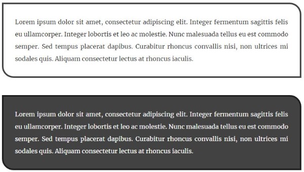
Both of these options add a similar styled decorative box to place content within. This is usually used to draw attention to particular pieces of information. Please see below for examples of how these items display.
Border/Colour Box Settings
When using the Edit Cog for your Border/Colour Box Content Element, it will give you access to the following options:
- Border Colour: This option allows you to edit the border colour for your element
- Background Colour: This option allows you to edit the background colour of your element
- Text Colour: This option allows you to edit the text colour of your element
- Layout: This option allows you to edit the current layout of your element. The available options are:
Text
Text with Left Image
Text with Right Image
Text with Image Above
Text with Image Below


